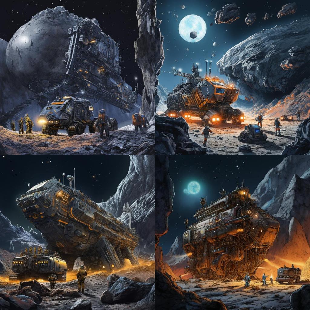
As I was trying to generate images of space miners a few days ago, I found that adding “Storybook Illustration” and “Water colors” allowed the images to be less gloomy with the darks and grays of outer-space, and added all sorts of colors that I had not quite anticipated: orange, tints of blue, neon, and specks of green (see below). These images may still seem dark, and relatively uniform in color, but they were far gloomier without qualifiers such as “Storybook Illustration” and “Water colors”.
So, what’s going on? Was it a fluke that qualifiers such “Water colors” produced such effects? I wanted to explore a bit more. In fact, I added one more to the set to arrive at three prompts qualifiers. I ran a different prompt on MJ, with different permutations of the three qualifiers, and the results were quite fascinating …
“Sketchbook Illustration”, “Storybook Illustration”, “Watercolors”
I added “Sketchbook Illustration” to the mix, because I had a feeling that drawings in a sketchbook tend to be less complete and less refined than those available in a story book. I was not wrong, but the consistency of the results surprised me.
For starters, I picked a different base-prompt, for the simple reason that I wanted to explore a different subject. So here was the base-prompt:
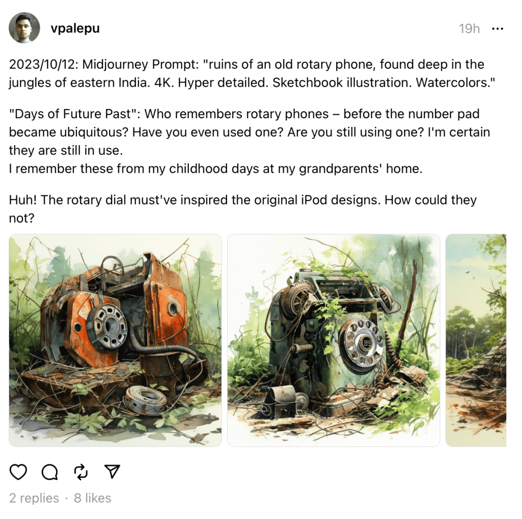
base-prompt: “ruins of an old rotary phone, found deep in the jungles of eastern India. 4K. Hyper detailed.“
To make things systematic, I ran that base-prompt with the following permutations of qualifiers:
- [base-prompt] Storybook Illustration.
- [base-prompt] Sketchbook Illustration.
- [base-prompt] Watercolors.
- [base-prompt] Storybook Illustration. Watercolors.
- [base-prompt] Sketchbook Illustration. Watercolors.
I will call these “Prompts a to e”
I ran each of these prompts on Midjourney three times. MJ produces 4 images on each run, so that got me 12 images, per prompt. And with 5 permutations (a to e), I ended up generating a total of 60 images. Here is an overview of all 60 images!
Prompt A:
[base-prompt] Storybook Illustration.
Prompt B:
[base-prompt] Sketchbook Illustration.
Prompt C:
[base-prompt] Watercolors.
Prompt D:
[base-prompt] Storybook Illustration. Watercolors.
Prompt E:
[base-prompt] Storybook Illustration. Watercolors.
Next, I will go over each prompt and pull out some observations.
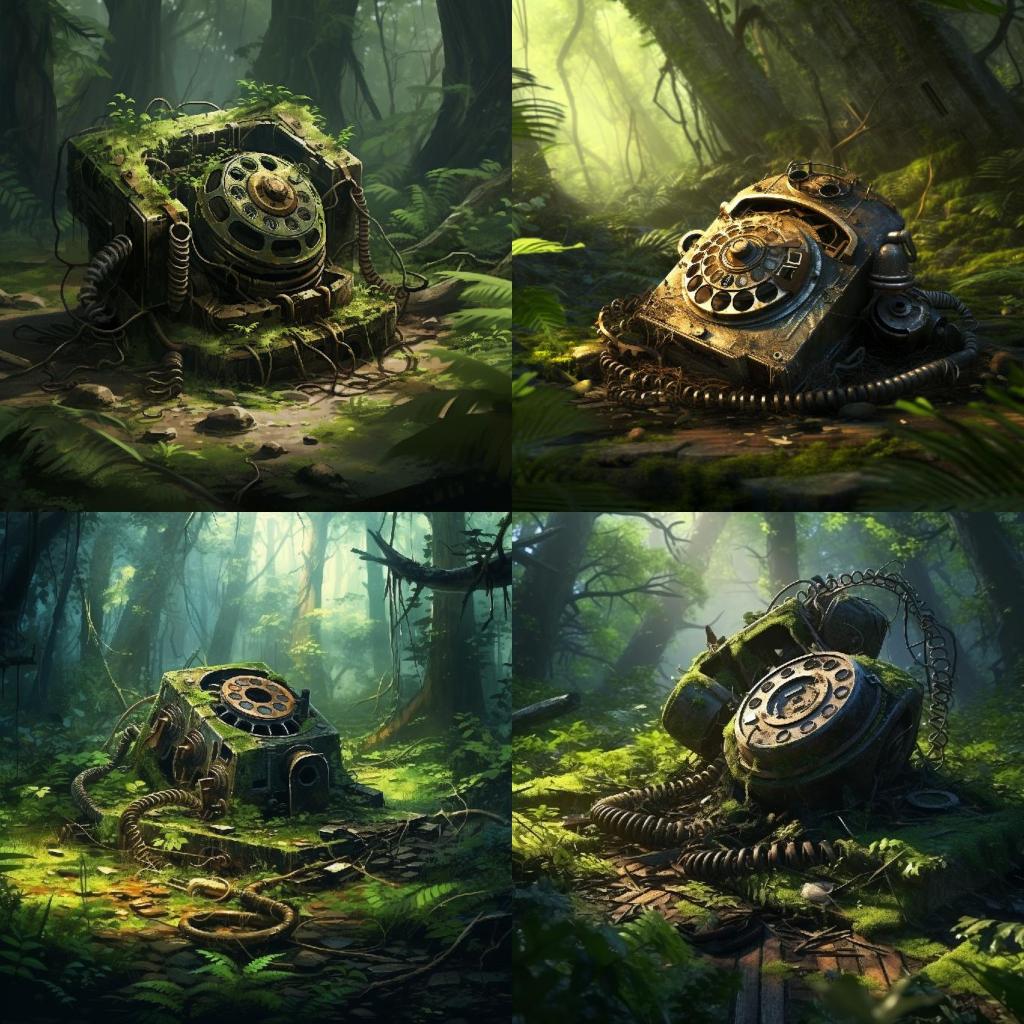
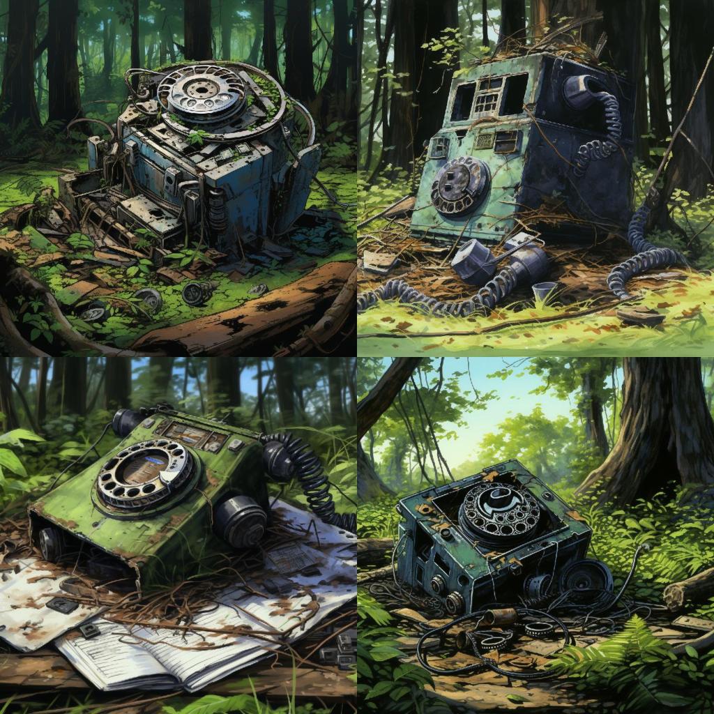
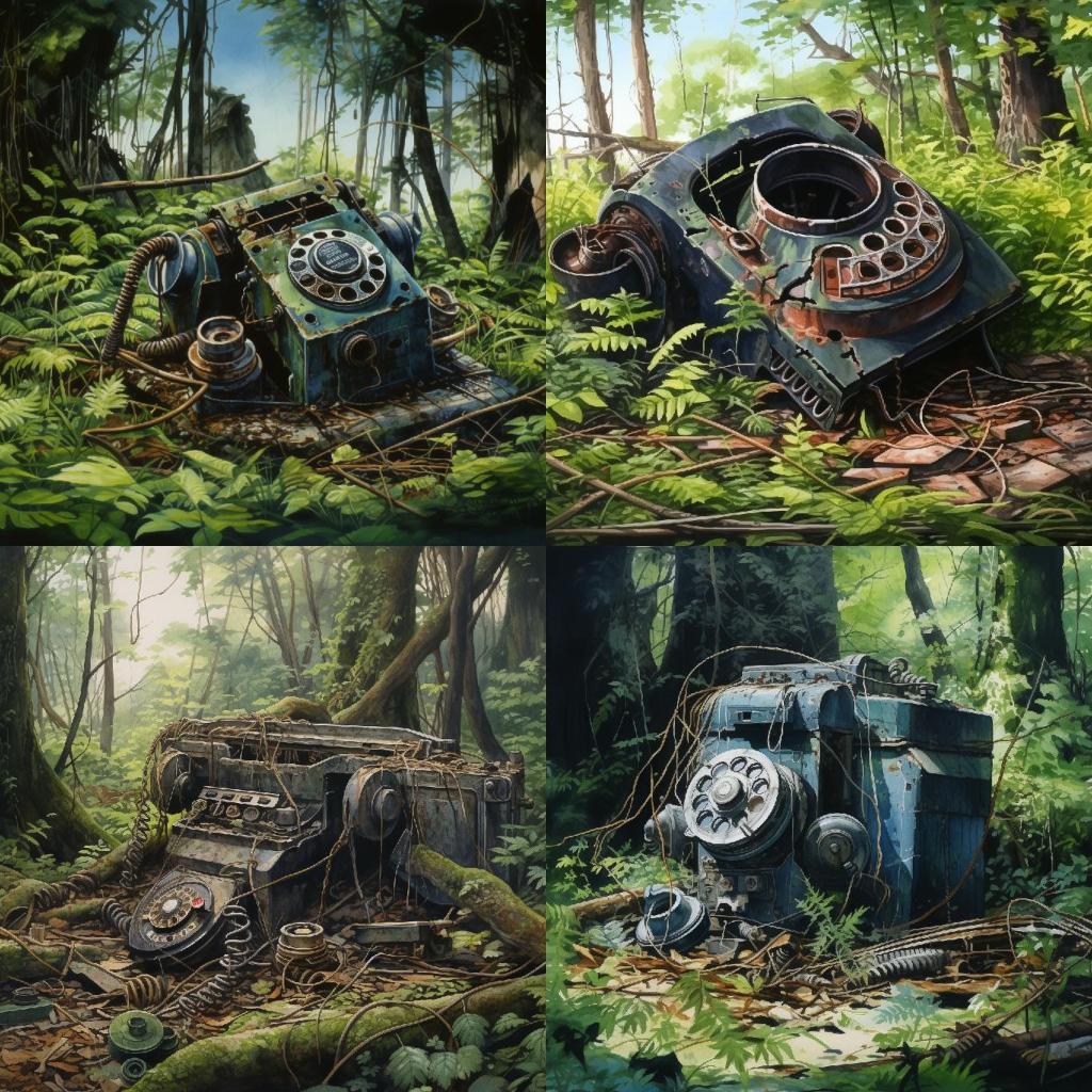
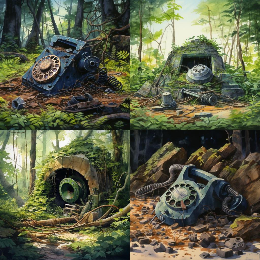
Prompt A: [base-prompt] Storybook Illustration.
Full prompt: “ruins of an old rotary phone, found deep in the jungles of eastern India. 4K. Hyper detailed. Storybook Illustration.”
Overall the results are satisfactory. Can’t complain. But let me front-load some observations that will become more obvious as we look at the other prompt permutations:
- Darker color tone: the images are dark, and that dark tone persists across the different sets of 4, i.e., different generations/runs on Midjourney.
- Limited color variation: While we see some variation in color, the darker tone of the images overwhelms any variation.
- Edge-to-edge coloring: all images have edge-to-edge color coverage; i.e., there isn’t a single empty/colorless pixel in these images.
Let’s look at sketchbook next.
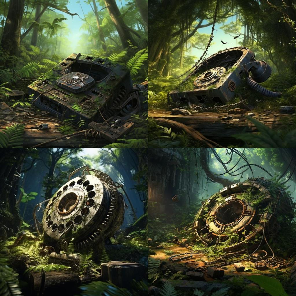
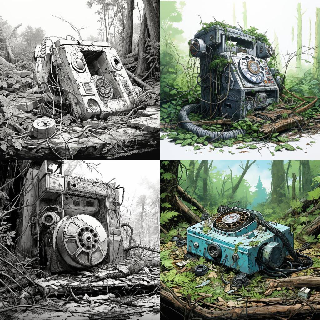
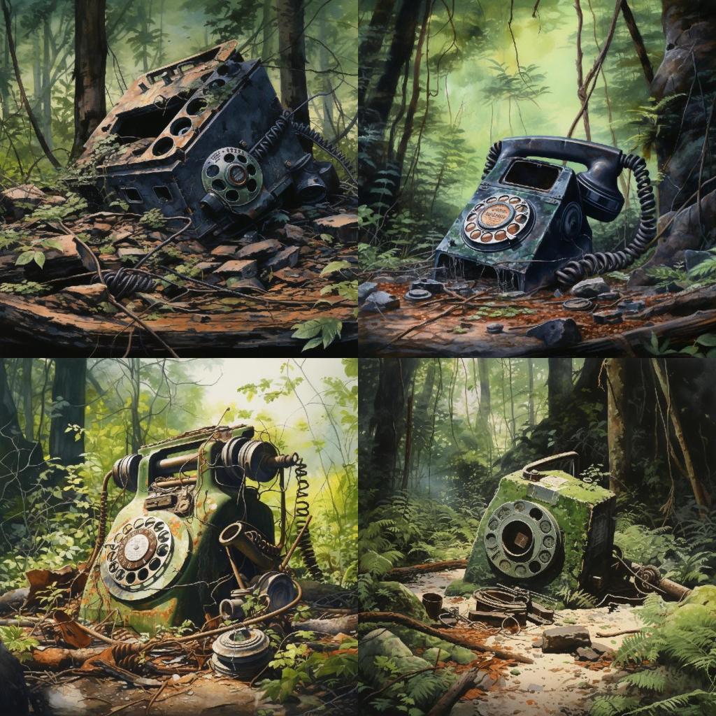
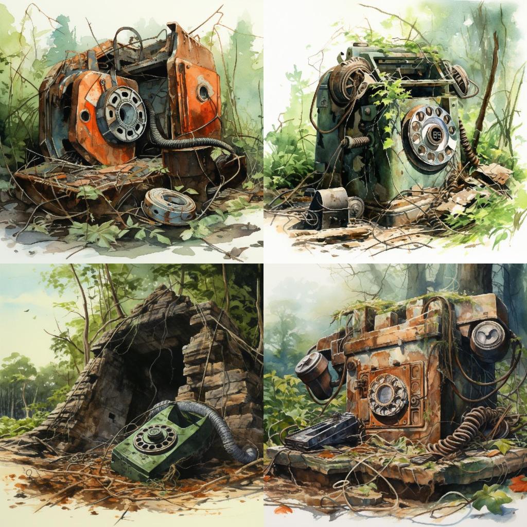
Prompt B: [base-prompt] Sketchbook Illustration.
Full prompt: “ruins of an old rotary phone, found deep in the jungles of eastern India. 4K. Hyper detailed. Sketchbook Illustration.”
The generated images are following the prompt well. But look at the differences from when we used “Storybook” as the prompt qualifier:
- Lighter color Tone: the color tone is noticeably lighter. In many images you are actually see the blue (or white) sky in the background. And two images are entirely color free!
- Better color variation: because the colors are lighter, you can see the colors of the phones come through a lot better. You have: colorless, blue, green, grey, metallic. You can also see better variety in the greens of the foliage that are conquering these old phones.
- Lesser Edge-to-edge coloring: Take a look at the images in the middle set of 4. Two of them are simply sketches. But the top-right image is peculiar: the bottom edge of that image is left without any color! Even its sky is left nearly white.
The differences between Prompt A, and Prompt B suggests that my instinct about “sketchbook” vs. “storybook” was not off. I found that to be fascinating, and it became even more interesting when looking at the Watercolors permutation.
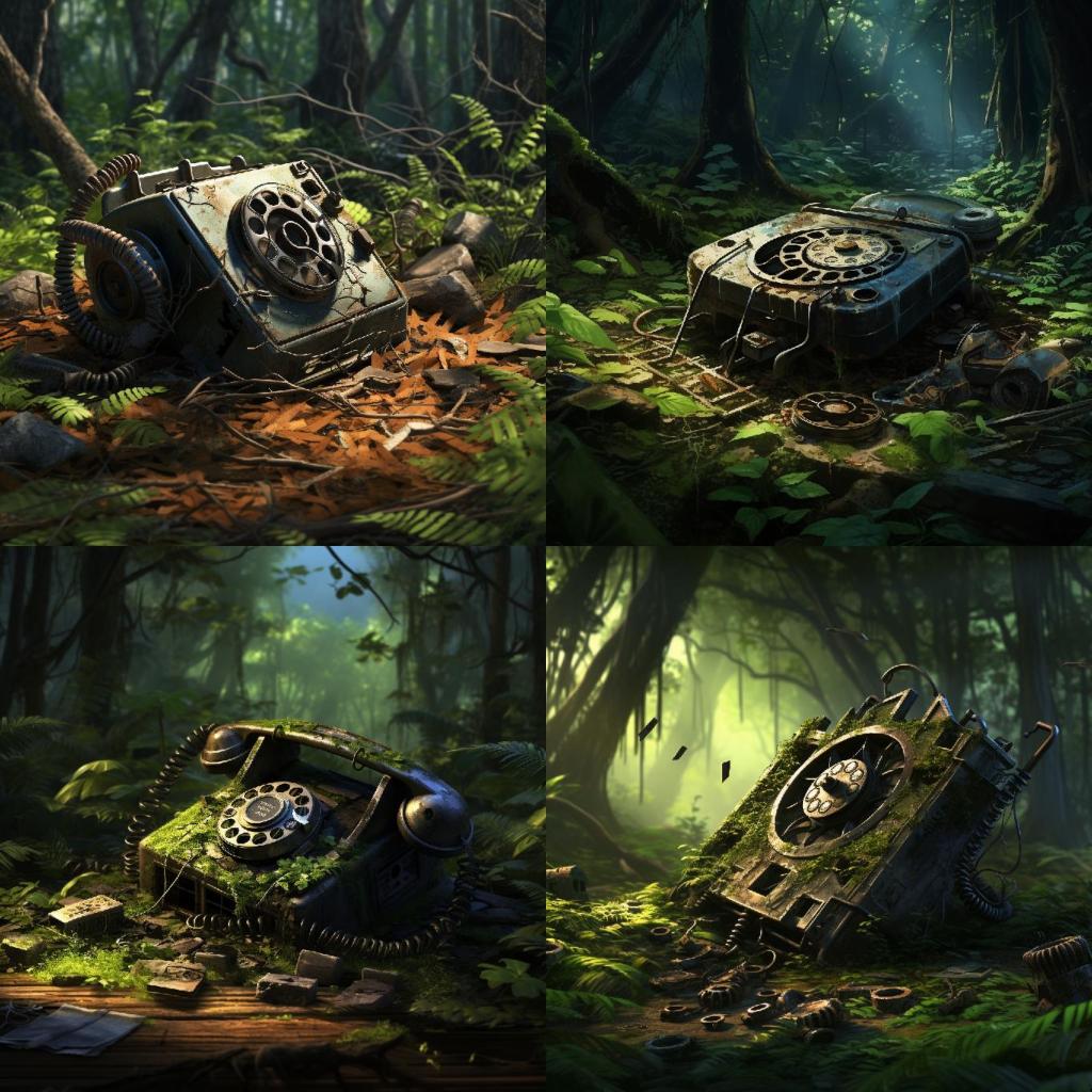
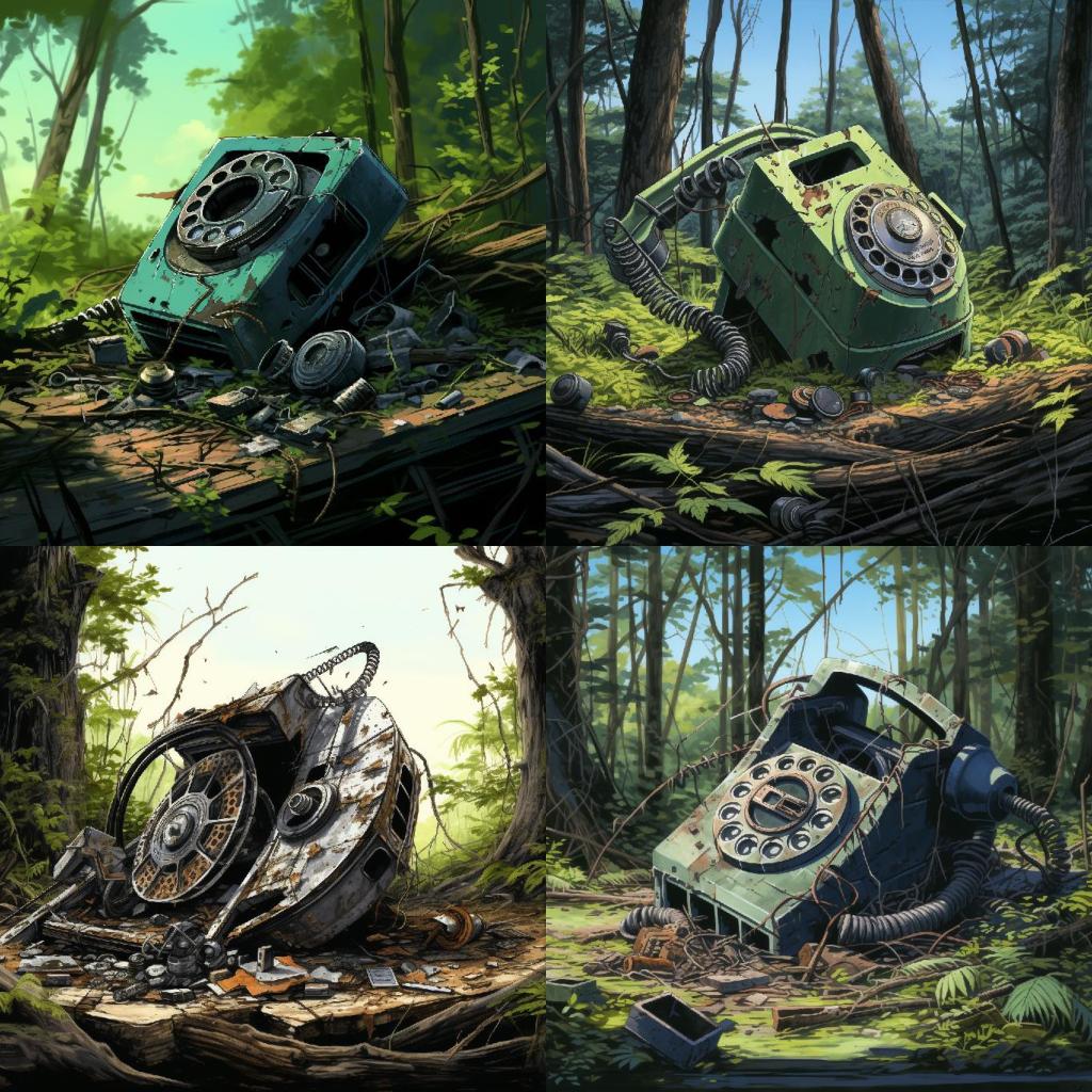
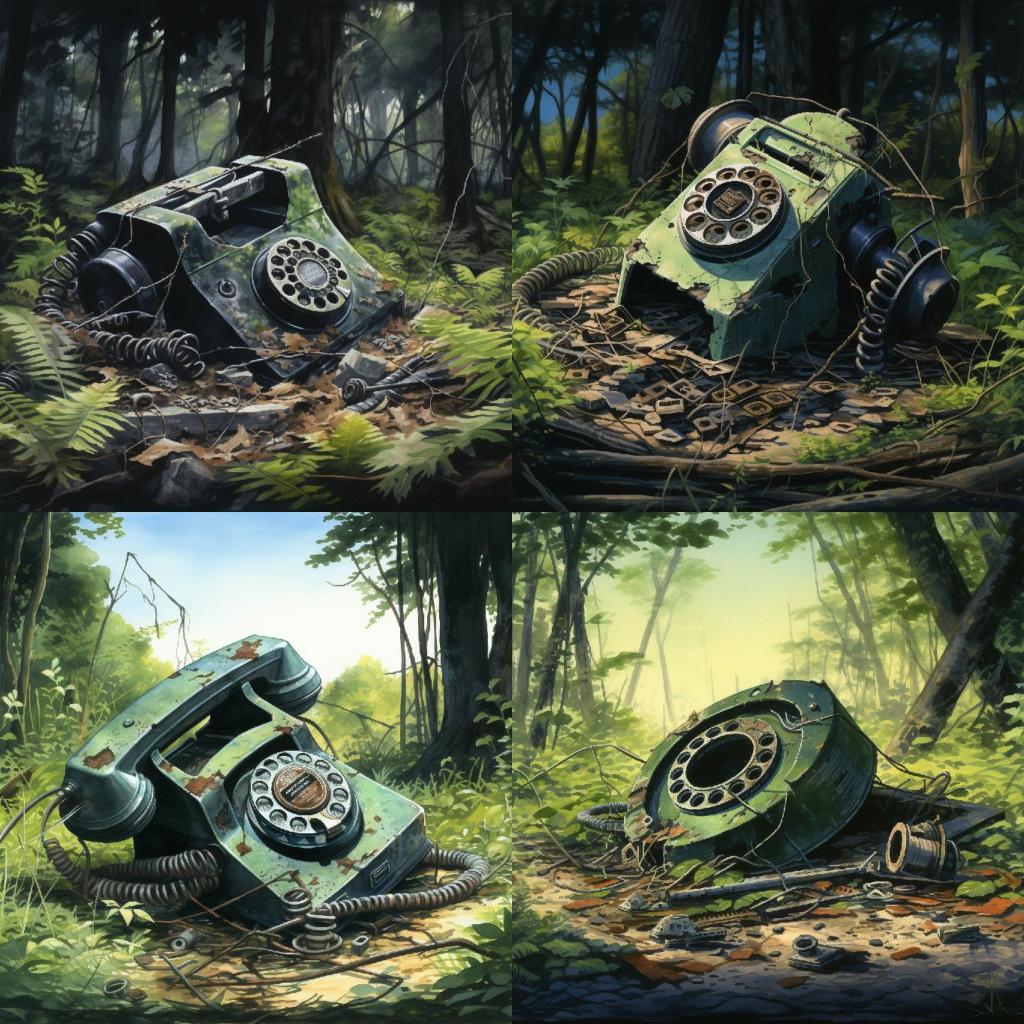
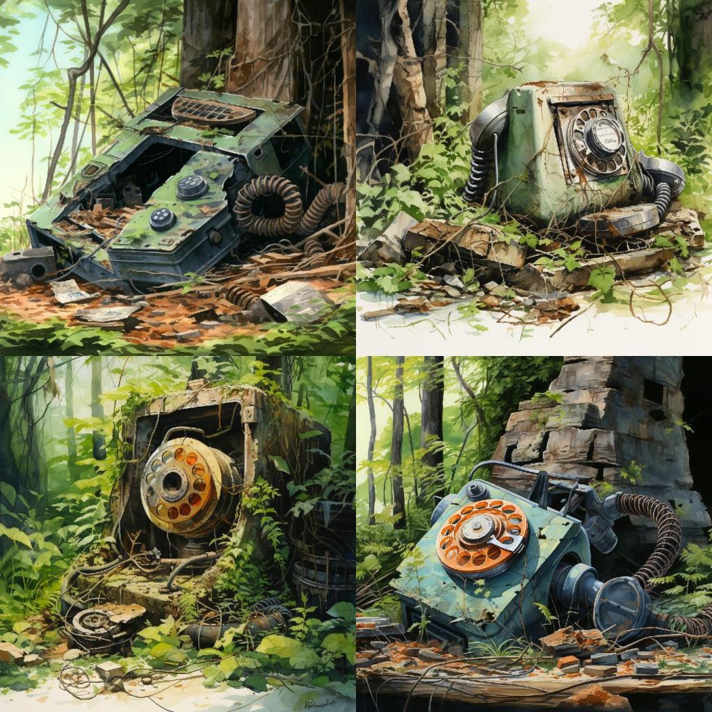
Prompt C: [base-prompt] Watercolors.
Full prompt: “ruins of an old rotary phone, found deep in the jungles of eastern India. 4K. Hyper detailed. Watercolors.”
It was not immediately obvious what was special about these images. At first glance, they look a lot like those produced by “Prompt B: [base-prompt] Sketchbook Illustration.” But on closer look, one thing jumped at me: Colors are brighter, and more vivid! And interestingly, the floor of the forest seems to have more light falling on it, in these images.
And this is where I will be pivoting the final two permutations, where I add “Watercolors” to Prompt A, and Prompt B.
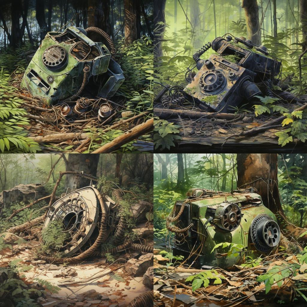
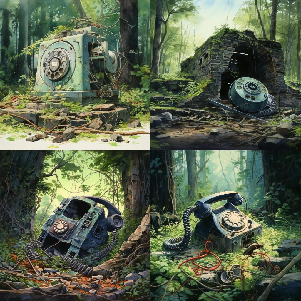
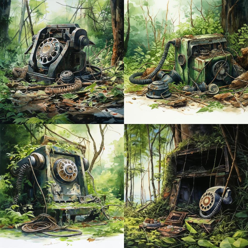
Prompt D: [base-prompt] Storybook Illustration. Watercolors.
Full prompt: “ruins of an old rotary phone, found deep in the jungles of eastern India. 4K. Hyper detailed. Storybook Illustration. Watercolors.”
This seems like an interesting mix between the results from “Storybook” and “Watercolors”, from above. You have edge-to-edge coverage in nearly every image, with bright, vivid colors. But some images still retain a darker tone to them. A mixed bag indeed.
And quite fascinating that combining prompt qualifiers like this can get somewhat predictable results — in how the style of the images have struck a middle ground between what MJ produced with just “Storybook” or “Watercolors” by itself.
But a quick comparison between the results of Prompt A and Prompt D shows that “Watercolors” certainly gives MJ the permission to produce more colorful variants, that are somewhat brighter. So my original suspicion was with the space-miner prompt was not off-base.
Let’s see if my instinct about “Sketchbook” vs. “Storybook” holds any water.
Prompt E: [base-prompt] Sketchbook Illustration. Watercolors.
Full prompt: “ruins of an old rotary phone, found deep in the jungles of eastern India. 4K. Hyper detailed. Sketchbook Illustration. Watercolors.”
Lighter in color, with little-to-no dark tones! Colors are bright and vivid! Multiple images do not have edge-to-edge color coverage. So much more variety in colors: there is a sea-green phone with an orange dial! It seems that if you want brightly colored images that go easy with dark tones and have a variety of colors, then “Sketchbook Illustration. Watercolors” will not disappoint.
I absolutely loved these images. And I shared them yesterday on Threads as part of my daily Midjourney Journal entry:
Such explorations are fun and instructive on how these image generation models behave. I hope to find more such patterns and behaviors in the days to come as I continue my daily Midjourney Journal. Feel free to follow me on Threads, or subscribe to this blog for more such updates.
— vijay, watching Naruto.

Leave a reply to Gunners Shot Cancel reply